案件需要一个比较直观的点分布图和热力图。
绘制底图
先从天地图拉一份全国地图的 geojson 数据,投影到 EPSG:4573,绘图看下。
1
2
3
4
5
6
7
8
9
| import geopandas
import matplotlib.pyplot as plt
import numpy as np
import pandas as pd
chn = geopandas.read_file(r"中国_省.geojson").to_crs("EPSG:4573")
fig, ax = plt.subplots(1, 1, figsize=(20, 20))
chn.plot(ax=ax, edgecolor='lightblue', facecolor='powderblue')
plt.show()
|
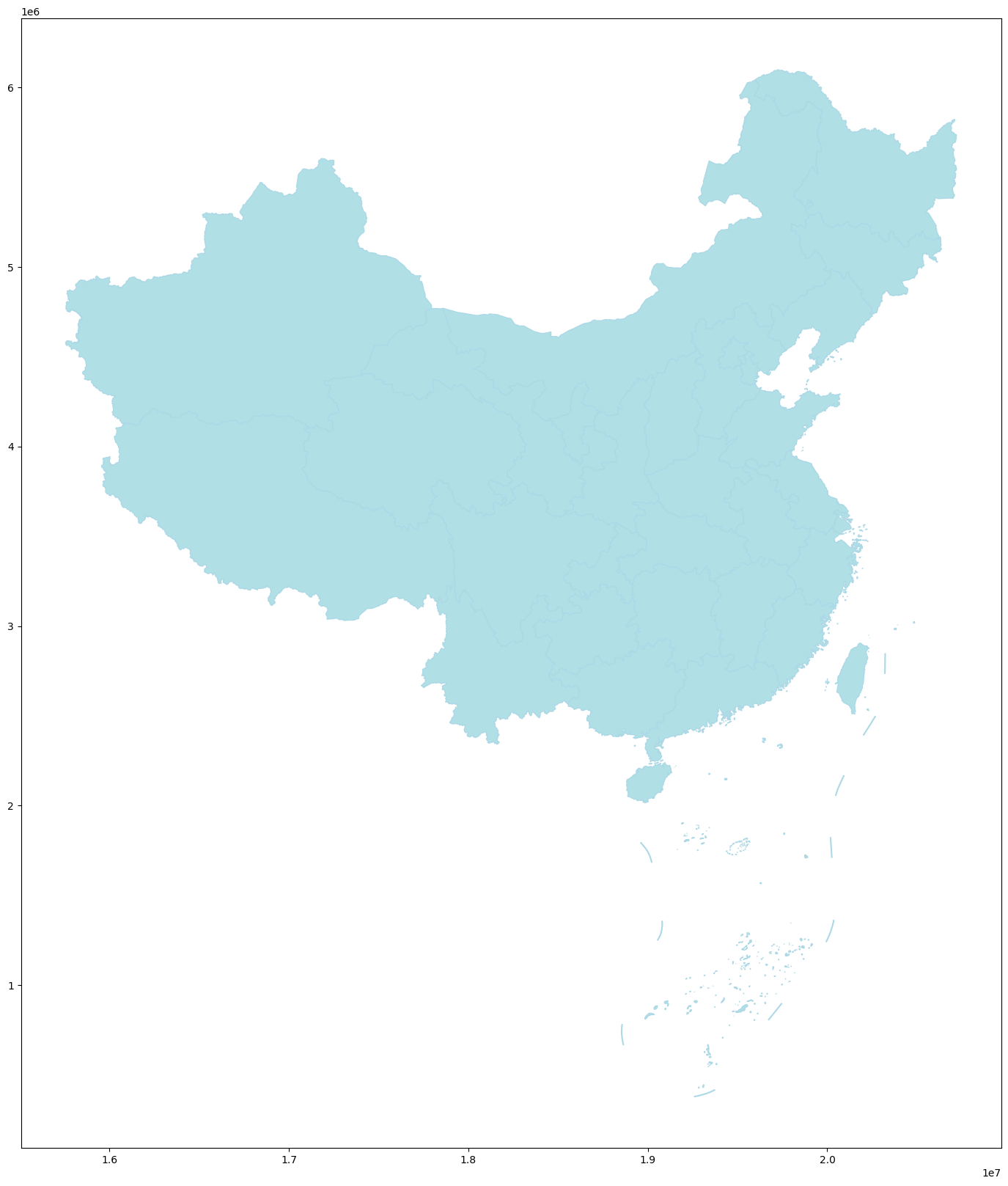
天地图的坐标是EPSG:4490(CGCS2000),没有用火星坐标,非常开发友好。
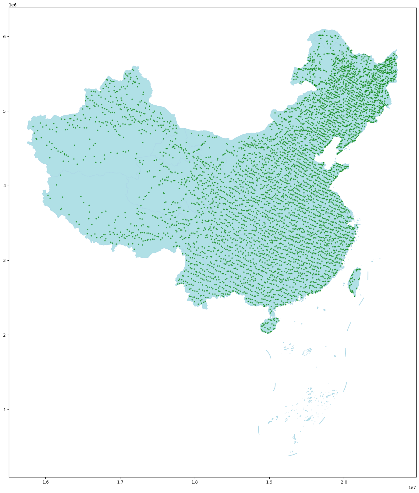
绘制点图
读取点图数据为points_df,这里用天地图的示例数据,先统一坐标系,案件原始数据是 WGS84 的坐标,则需要set_crs("EPSG:4326")。
1
2
3
4
5
6
|
points_df = pd.read_csv(...)
points_gdf = geopandas.GeoDataFrame(
points_df,
geometry=geopandas.points_from_xy(points_df.lon, points_df.lat)
).set_crs("EPSG:4490").to_crs("EPSG:4573")
|
利用geopandas.sjoin()筛选底图范围内的点。
1
2
3
| points_gdf = geopandas.GeoDataFrame(points_df, geometry=geopandas.points_from_xy(points_df.lon, points_df.lat)).set_crs("EPSG:4326").to_crs("EPSG:4573")
points_index = geopandas.sjoin(points_gdf, chn, how='left')
points_inside_chn = points_index[points_index['index_right'].notna()]
|
绘制点图。
1
2
3
4
5
6
7
8
9
10
11
| fig, ax = plt.subplots(1, 1, figsize=(20, 20))
chn.plot(ax=ax, edgecolor='lightblue', facecolor='powderblue')
points_inside_chn.plot(
ax=ax,
marker='o',
color='green',
markersize=5,
alpha=0.6,
label='Points'
)
plt.show()
|
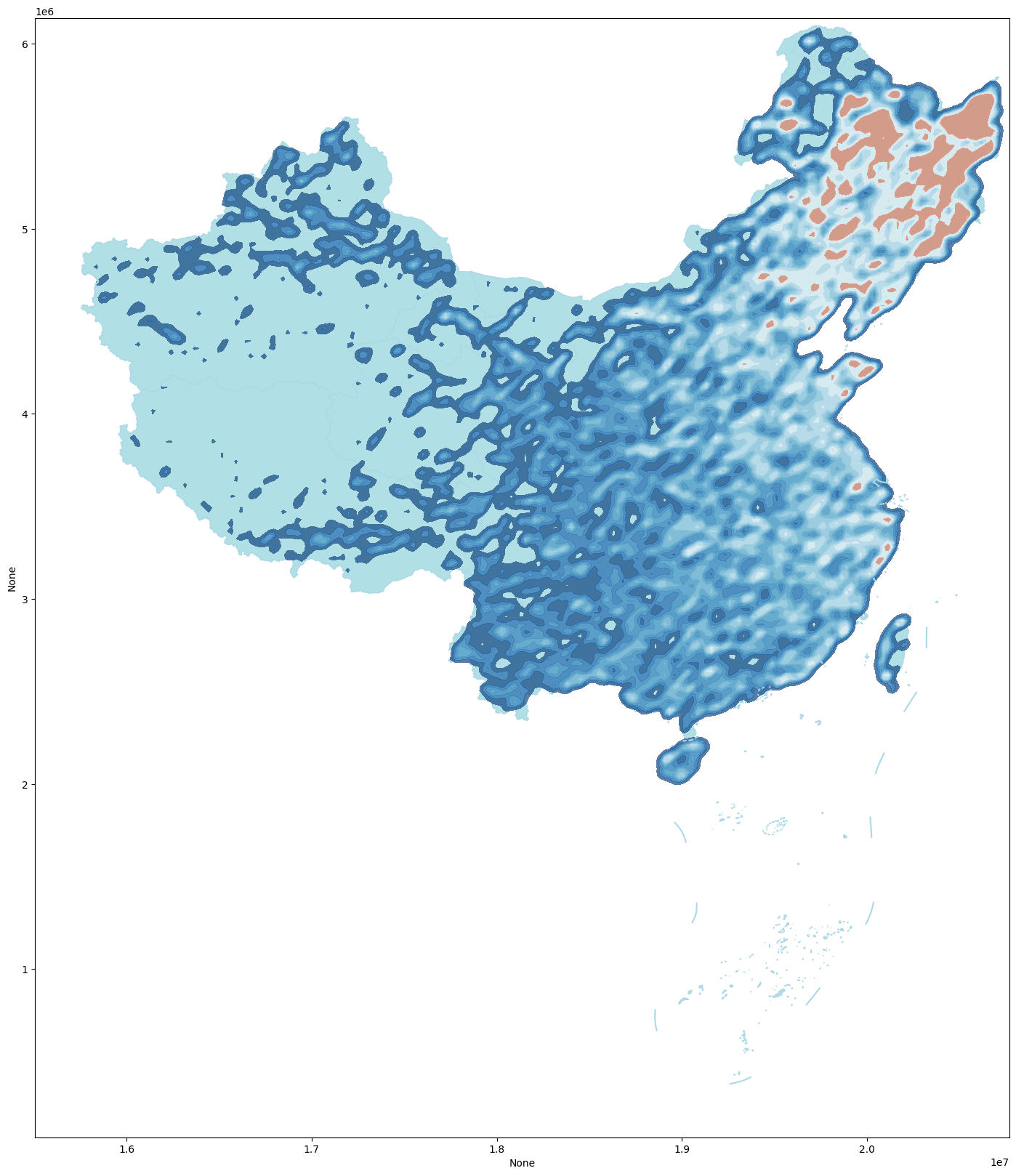
绘制热力图
这里用了 seaborn.kdeplot 核密度估计 (kernel density estimation) 做数据可视化。
1
2
3
4
5
6
7
8
9
10
11
12
13
14
15
16
17
18
19
| import seaborn as sns
x_coords = points_inside_chn.geometry.x
y_coords = points_inside_chn.geometry.y
fig, ax = plt.subplots(1, 1, figsize=(20, 20))
chn.plot(ax=ax, edgecolor='lightblue', facecolor='powderblue')
sns.kdeplot(
x=x_coords,
y=y_coords,
cmap="RdBu_r",
fill=True,
alpha=0.7,
bw_adjust=0.1,
ax=ax
)
plt.show()
|